|
I think that the best artwork that I did this semester has to be 'The Vision' where I was able to make what I see versus what other people see.
I think I would like to redo the Imagination artwork which I was proud of it because it portrays something from my favorite video game. I kinda want it to be just a tad bit more realistic. I learned how to make sure that what is supposed to be seen doesn't clash with the background. This happened with The Pendant. I have to make sure that i'm constantly looking up other artists so I can get ideas. I should be able to try out new tools and techniques such as the stippling with the Imagination artwork. I kinda wish that we could've done something just a tad different but since I had taken the same class last semester I kinda already had recent experience with what to do.
0 Comments
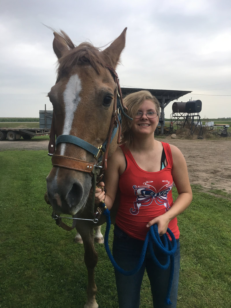
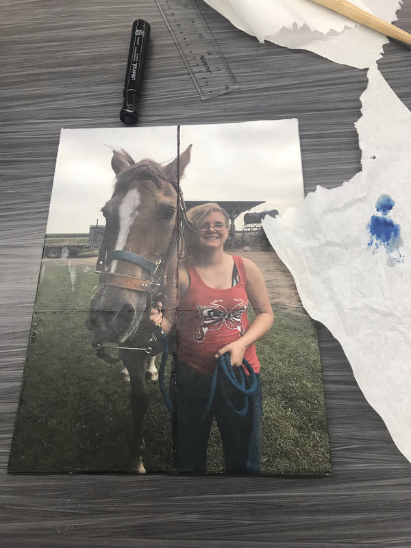
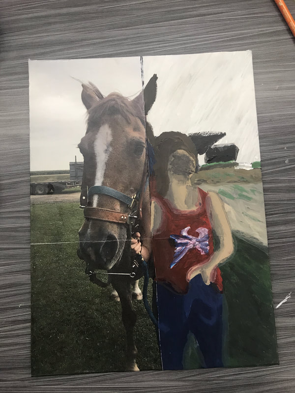
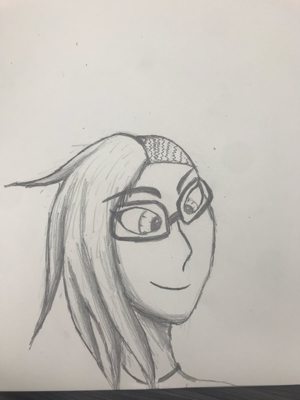
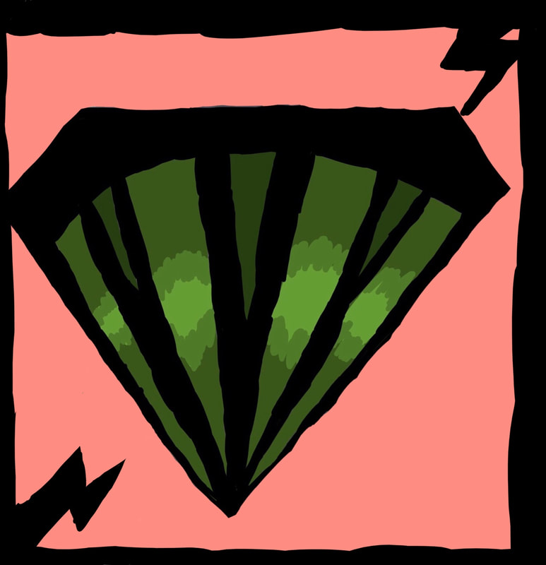
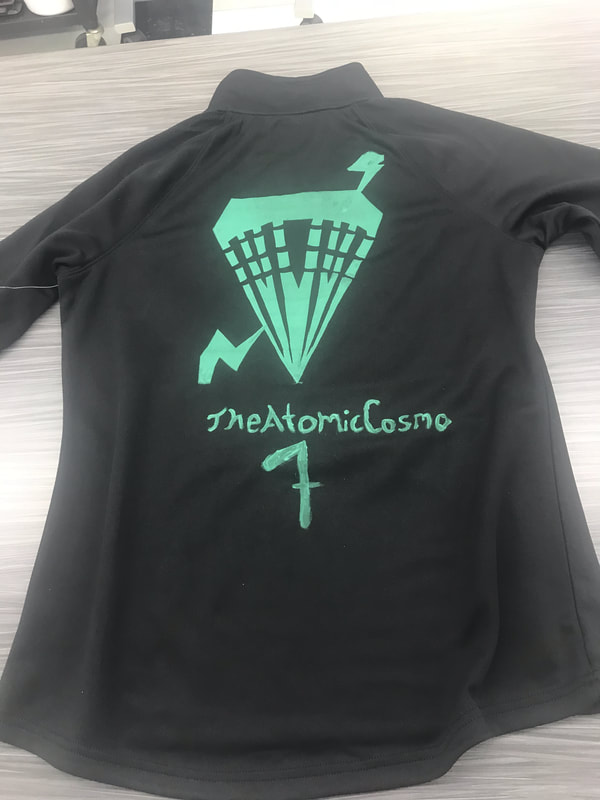
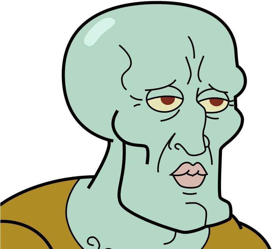
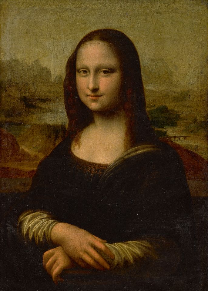
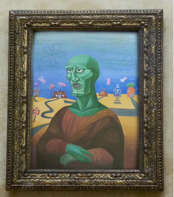
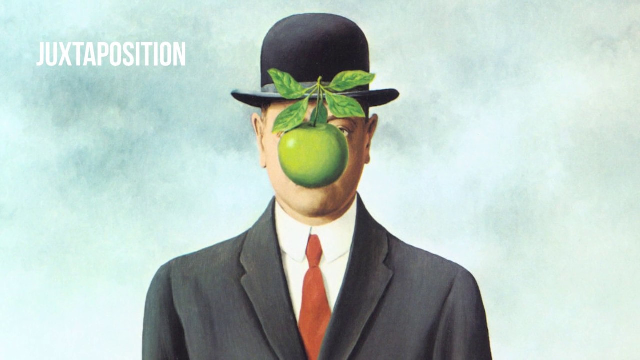
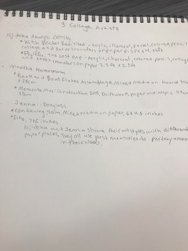
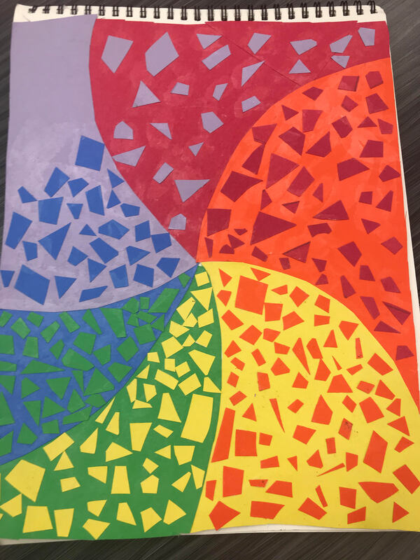
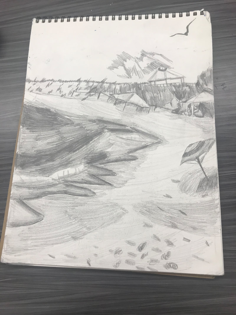
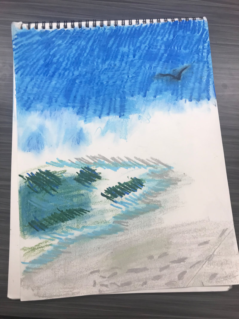
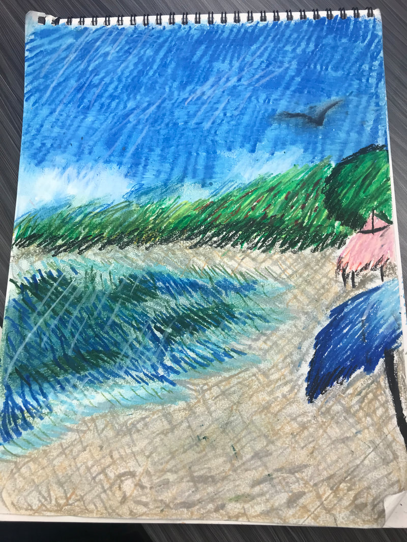
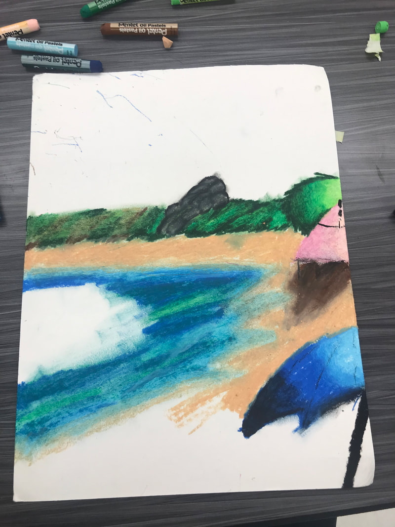
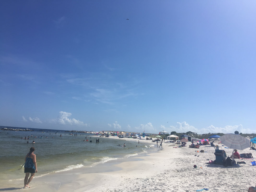
1. My final artwork is about what I see verses what other people may see regard to their vision in contrast to mine. This looks like a picture of some girl (Me) next to a horse. The finished project looks the same except that its cut in half and its all blurry on the right side. 2. I created my artwork by using a canvas and a picture that I had printed off and then used acrylic paint on the right side. 3. The big idea behind this artwork is that i've wanted for a while to create something from my eye perspective (Literally, like without my glasses on because I can't see anything.) 4. My goal was to continue taking off my glasses in order to mix some of the colors together to see how it would look. My second goal was to create something based on what I see and having someone else become completely confused while looking at it. 5. My overall thoughts while making this include the fact that I know I could've done just a little bit better but if my glasses are off than everything is going to be blurry and I wanted to see how that would look like on a canvas. i want to create something that expresses something about me that normal people can't see, such as my eyesight and how bad it is. I will be reflecting what I see verses what other people may see when looking at a picture of something or someone. Firstly needed to engage and persist when I didn't exactly know how this would turn out after I really thought about it I was able envision what I needed for the steps and how it would look like on a canvas. My plan has stayed the same with the same goal: Create something of what I see verses what someone else would see. I'm kinda proud of myself about the fact that I've had to use glasses over the years instead of just switching to contacts. I plan to improve my ability to draw something that's either in front of me or something that i'm thinking about. (I only had one picture of the process photo because I was so engrossed in what I was doing.) 1. My artwork is of a cross between Mona Lisa and Handsome Squidward from Spongebob. It also has captions underneath them on what Squidward would say regarding these different pieces of art, and the last one is of the mix between Mona Lisa and Handsome Squidward; Handsome Mona Lisa. 2. I created this by using printed off pictures, three of them were exactly the same of Mona Lisa, I also printed off Squidward's Nose, and a picture of Handsome Squidward. I glued them together after cutting and tampering with the pictures. I also painted dark brown in place of Mona Lisa's hair. 3. The big idea behind this artwork is that anything can be art and because I got the inspiration in Mrs. Underhill's room on the top shelf is a cardboard drawing of Handsome Squidward. 4. My goal was to kinda recreate something that I like in both of the. I was using juxtaposition. 5. My overall thoughts is that I did have fun while making this short and fast. I kinda wanted to color the remaining parts of the last Mona Lisa the color of Squidward. 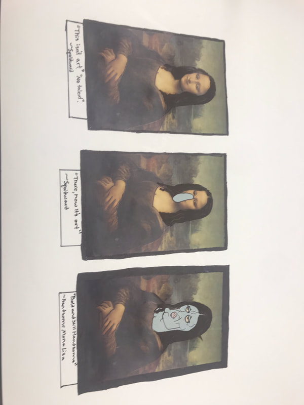 I created my own original logo and then screen printed it out onto a Avia jacket. I was planning on swapping the green and the black but I thought it would look cooler. I had decided to add my gamertag on the back just because it goes with the logo. Develop craft was used in the making of this print because I needed to use the screen print and write the gamertag. I've never had to write in the ink before and I believe that I messed it up. I will be using Juxtaposition in my artwork. My plan in this artwork will be of taking a picture of handsome Squidward's face and the body Mona Lisa and combining the two. I forgot to take any progress photos during the making of this because I was way to focused on creating it. While creating this I had to be using the envision studio habit so I could see how Handsome Mona Lisa would look like even before I put the idea on paper. I needed to use the engage and persist when there were already pictures of different handsome squidward and mona lisa. For my postmodern principle I will be using Juxtaposition by taking two completely different pictures and combining them. I am hoping I can just print out the pictures and then glue them on it. Postmodern Principles Appropriation- purposely taking images and recreate them. Recontextualization- Taking normal context-> new meaning Juxtaposition- Put two things which don't go together Hybridity- Bring together two cultures/Exploring, multiple meaning in art Text & Image- The words give photo new meaning Representing- Using your self to make artwork The Gaze- Subject that makes you think :Layering- Pile on top of eachother Mixed Media Collage artwork- made by me with mixed colors of different colored paper. I used mixed shapes and then place them into the next color on there right. I reflect on moving the colors into a weird and abstract way because i've never done anything with using colors like this before. Njideka Akunyili Crosby- Witch Doctor Revisited, Efulefu. (Usually usually she uses charcoal with her artworks. Martha Haversham- Bark and Boat Flakes, Memento Mori Construction. (Usually uses driftwood and acrylic) My artwork is from a picture that I took it at Panama city beach when we visited in 2018. I might have not included a couple of details because there just wasn't enough room and I didn't want to add any people. The water in the beach was kind of a green color but I couldn't exactly get the color just right but it turned out great. The skies look like they are darkening because I wanted it to look 'cool'. There a couple of umbrellas kind of right next to another umbrella. I created this completely with oil pastel and I would rub it with a tissue to fade the colors into another. The big idea behind my artwork is that I wanted to do a picture of something that I wanted to create something based on an original image or picture that I have taken at some point in my life. The goal was to create something original and use nothing from the internet. My overall thoughts on this is that I really liked how this turned out. What confuses me the most is why I made the sky dark. I also wanted to put some kind of existence for humans so I did my own version of footprints. I have a picture of the reference photo that I took down at Panama city beach on the bottom right. 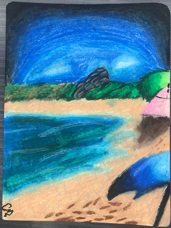 |

 RSS Feed
